Moving services | Usability Audit / USA

The primary objective of this project was to conduct a comprehensive usability audit of the corporate website for a moving services company, TwoMenAndMovingVan.com. The goal was to identify critical usability issues and barriers within the user journey that hinder conversion and negatively impact user perception. Key focus areas included streamlining navigation, improving the clarity of calls-to-action (CTAs), and enhancing the overall user experience to increase lead generation and build trust.
2. Audit Methodology
The audit encompassed a detailed analysis of both the desktop and mobile versions of the website to ensure a consistent and effective user experience across all devices. The methodology involved a heuristic evaluation based on best practices and a competitive analysis, referencing solutions from nine key competitors and industry leaders.
The analysis focused on key user scenarios and site modules, including:
- Global Elements: Header, footer, and navigation menus.
- Key Pages: The Homepage, About, Services, Locations, Pricing, Careers, Blog/News, and Contact Us pages were individually assessed.
- Conversion Funnels: Quote request forms and the online chat functionality.
While the sources do not specify the use of tools like Google Analytics or heatmaps, the audit was grounded in neuromarketing principles and the 7Ps Marketing Mix concept (specifically People, Process, and Physical Evidence) to evaluate the psychological impact of the site’s design and content on user behavior.
3. Key Findings and Issues
The audit identified 24 specific issues on the desktop version and 7 on the mobile version. These can be grouped into the following categories:
- Navigation and Information Architecture:
-
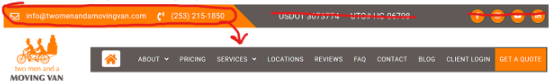
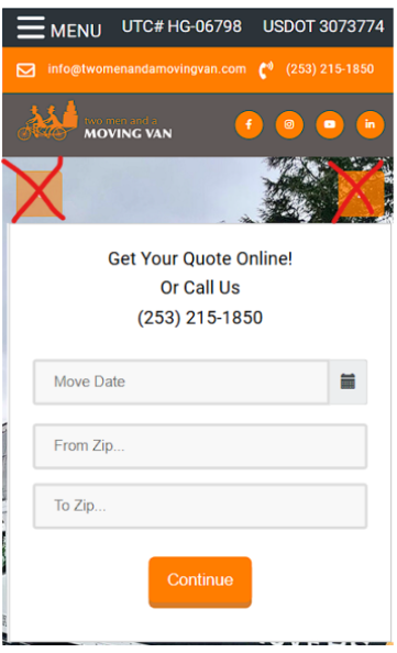
- The site header was cluttered with redundant links (e.g., a «Home» icon), social media icons, and poorly grouped contact information, making it vertically oversized.

-
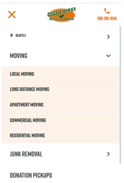
- The main menu structure was suboptimal and included a «Client Login» link that could be minimized.
-
- The footer lacked clear structure, failing to categorize links effectively or emphasize contact methods.

- The absence of a site search function limited users’ ability to find information quickly.
-
- Content and Visual Presentation:
-
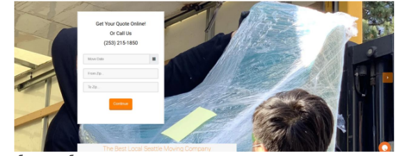
- The Homepage featured plain text with non-functional images and buttons, lacking crucial elements like social proof, service lists, and clear CTAs.

-
- Employee photos showing staff in masks were outdated and did not convey trust or professionalism. A recommendation was made to use photos of strong, open-faced individuals in branded uniforms.

- There was a lack of «Physical Evidence» such as photos of branded trucks, uniforms, and equipment, which is critical for building trust in the moving industry.
- Content on pages like «Services» and «Locations» was not conversion-oriented and lacked essential elements like multiple CTA forms, testimonials, and FAQs.
-
- Conversion Barriers and CTA Issues:
-
- Key pages, including service pages, often had an insufficient number of lead generation forms or buttons (the recommendation was for a minimum of three per page).
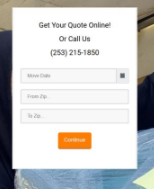
- The «Get a Quote» page lacked social proof and other trust-building elements to facilitate decision-making.

-
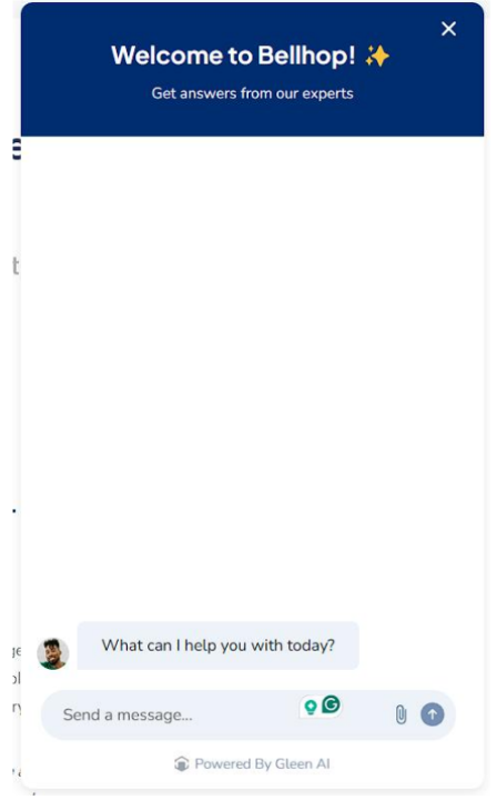
- The online chat required users to enter personal data before starting a conversation, creating a barrier to engagement.

- The site was missing an exit-intent popup to capture potentially lost leads with a special offer.
-
- Mobile Experience Deficiencies:
-
- The mobile header and offer presentation were not optimized and lagged behind competitor solutions.

-
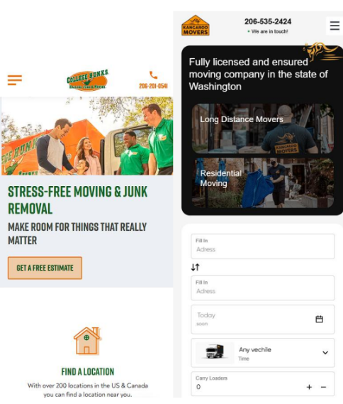
- A photo slider on the first screen was not mobile-friendly and was recommended for replacement with a single static image or background video.

-
- The «Burger» menu styling was outdated.

- There was no fixed top bar with links to key functions, forcing users to scroll excessively.
-
4. Recommendations and Prioritization
The audit resulted in a total of 31 actionable recommendations aimed at a complete overhaul of the website’s user experience and conversion strategy. While the source documents do not explicitly assign priority levels (e.g., high, medium, low), recommendations can be grouped by their potential impact.
High-Priority Recommendations (Core User Experience & Conversion):
- Redesign the Header and Footer: Streamline the header by consolidating CTAs into a «Free Quote» button, reorganizing the menu, and removing clutter. Restructure the footer to highlight contact options and logically group links.
- Overhaul the Homepage: Rebuild the homepage content structure to include offers, company benefits, social proof, a list of services, lead capture forms, and FAQs.
- Optimize «Services» and «Locations» Pages: Reformat these core pages to be conversion-focused, integrating at least three CTA forms, testimonials, ratings, and relevant FAQs on each.
- Improve Mobile Usability: Redesign the mobile header, implement a fixed navigation bar with key actions, and update the burger menu style.
- Enhance Trust and Credibility: Replace outdated photos with professional, branded images of the team. Add sections for «Physical Evidence» like branded trucks and equipment, and prominently display licenses, insurance information, and customer reviews.
Further Strategic Enhancements:
- Content and SEO: Add a site search function, remove the COVID-19 banner, and strategically add new, value-driven pages under the «About» section (e.g., Company History, Awards, Our Values).
- Lead Generation: Implement an exit-intent popup with a discount offer and simplify the online chat initiation process.
- Branding: Re-evaluate the brand’s visual identity, including the logo and color palette, to better convey strength, speed, and reliability in line with neuromarketing principles.